
 ไทย
ไทย English
 中國人
中國人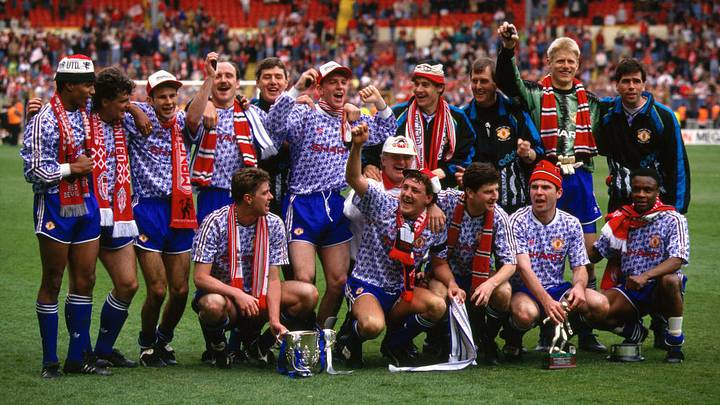
Manchester United's kits have frequently matched their extraordinary performances on the pitch over the last four decades, particularly when it comes to their away and third strips.
Some breathtaking designs have been crafted by adidas, Umbro and Nike alike, with their 2026–27 third shirt adding yet another entry to a long list of iconic looks.

However, alongside the stunning efforts inevitably come a few unfortunate blunders—kits more suited to Ruben Amorim's struggling United than the glory days of Sir Alex Ferguson.
With that in mind, here's a look at the club's finest and most forgettable alternate strips.
Best of Man Utd's Alternate Kits
1990–92 Away
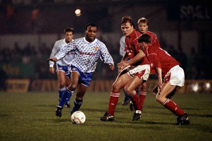
Few football kits have achieved the legendary status of United's celebrated 'snowflake' design from the 1990–92 seasons. Despite being synonymous with red, the club has frequently turned to a contrasting blue change strip, with none managing to surpass one of their earliest versions.
The vintage adidas Trefoil. The bold red Sharp sponsor and classic club badge. The stunning repeated pattern running the full length of the shirt.
What's not to admire?
1992–94 Third

Before United became the club we know today, they were 'Newton Heath'. And before they adopted their now-iconic red, they played in green and gold.
The 1992–94 third shirt paid tribute to those historic colours with a half-and-half design created in collaboration with Umbro. The green and gold combination has taken on a significance of its own since then, even being adopted as a powerful protest against Glazer ownership in scarf form.
Nostalgia undoubtedly plays a role in viewing vintage kits through a fond lens, and this '90s gem—enhanced by a retro lace-up collar—is forever tied to the golden era surrounding the Premier League's birth.
1994–96 Third
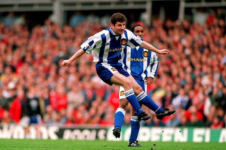
Umbro delivered hit after hit for United before the millennium, even crafting their own blue and white masterpiece shortly after adidas's effort had captivated fans.
Umbro went with a deeper shade of blue for their shirt, pairing it with white stripes and a striking United crest set within a black shield. The stripes even carried through to the shorts, which was an elegant finishing touch.
Absolutely stunning.
2003–05 Third

Nike assumed control of United's kit production in 2002 and delivered some real gems, even if they were generally less adventurous than the adidas and Umbro offerings of the 1990s.
Their sharp white third shirt worn between 2003–05, however, was a particularly impressive piece of design.
The iconic Vodafone sponsor sat prominently across the chest over horizontal black and red pinstripes, further complemented by a bold collar with black piping.
2009–10 Away

Sometimes, simplicity wins.
Another elegant Nike shirt turned heads in the late 2000s as United went with a bold chevron design across the chest of both their home and away kits for the 2009–10 season.
The red and black home shirt provided a perfect contrast to the black and blue away strip, both offering clean designs with just a touch of personality.
Not revolutionary, but undeniably appealing.
2024–25 Away
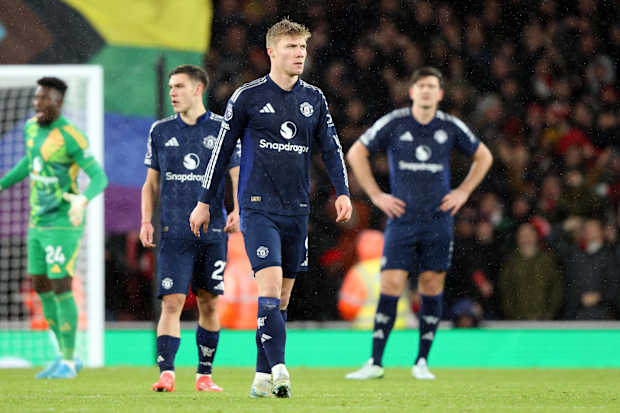
The Red Devils rekindled their relationship with adidas in 2016 and while they've yet to recapture the magic of their earlier collaboration, the 2024–25 away shirt was certainly a move in the right direction after a string of underwhelming releases.
A deep navy blue shirt was brought to life by a repeating 'M' motif, drawing inspiration from three of Manchester's rivers—the Irk, Medlock and Irwell.
What truly sets this one apart, though, is the silver detailing. The badge, sponsor and sleeve stripes all stand out beautifully.
Worst of Man Utd's Alternate Kits
1995–96 Away

After finding themselves 3–0 down to Southampton at the break while wearing this grey disaster, Ferguson famously instructed his players to switch into the previously mentioned 1994–96 third kit. He argued his players couldn't pick each other out on the pitch, and to his credit, United won the second half—though they still fell to a 3–1 defeat.
It was the fifth and final appearance of the shirt, having failed to secure a single victory while wearing it.
Regardless of the visibility debate, United were right to ditch this ill-fated strip just before their Premier League title win. It's hardly the look of champions.
2013–14 Away

On the pitch, United suffered a wretched 2013–14 campaign following Ferguson's retirement and the appointment of David Moyes, and their away kit for that season was a fitting reflection of their poor form.
A navy blue tartan pattern was never going to fly off the shelves and did little to lift spirits around the dugout.
The golden Premier League patches on the sleeves were about the only saving grace.
2020–21 Third

Commonly referred to as United's 'zebra kit', this ranks not only among the club's worst ever designs, but as one of the most unattractive shirts in Premier League history.
An asymmetric black and white diagonal stripe pattern was never going to impress, with vivid red accents and the gold Chevrolet sponsor only adding to the visual chaos.
It's likely this shirt will develop a cult following over time, filed firmly under the 'so bad it's good' category.
2023–24 Away

United's 2023–24 away kit supposedly "draws inspiration from the club's early away strips, introducing a fresh interpretation of the classic green colour. Maroon-red lines punctuate white blocks, reminiscent of the city's distinctive red bricks and architecture."
Set aside the marketing language for a moment, and it becomes obvious this kit is genuinely awful.
The reimagined green simply doesn't work, and neither do the thick white stripes or the Team Viewer branding. This one is best left in the past.